Microcopy holds the secret to transforming user experience from frustrating to frictionless. These tiny text elements guide, reassure, and engage users at critical moments throughout their digital journey.
🎯 The Hidden Language That Drives Digital Success
Every tap, click, and scroll in a digital product is influenced by words—not just headlines or body copy, but the small, often overlooked snippets of text that appear at decision points. This is microcopy: the button labels, error messages, form field instructions, and tooltip text that either smooths the path forward or creates unnecessary obstacles.
While designers obsess over visual hierarchies and developers optimize loading times, microcopy quietly determines whether users complete purchases, sign up for newsletters, or abandon your platform altogether. Research shows that strategic microcopy improvements can increase conversion rates by up to 161%, yet it remains one of the most underutilized tools in the UX arsenal.
The difference between “Submit” and “Get My Free Guide” on a button might seem trivial, but it represents a fundamental shift in how we communicate with users. One is a command; the other is a value proposition. One creates cognitive friction; the other eliminates doubt and propels action.
Understanding User Friction: The Silent Conversion Killer
User friction occurs whenever someone encounters resistance while trying to accomplish a goal on your platform. It manifests as hesitation, confusion, anxiety, or frustration—all emotions that drain momentum and increase abandonment rates.
Friction takes many forms. It’s the password requirement that seems arbitrary. It’s the error message that blames without helping. It’s the form field without context that makes users wonder if they’re entering information correctly. Each instance of friction compounds, creating a cumulative burden that eventually overwhelms user patience.
The Psychology Behind User Hesitation
Cognitive load theory explains why small text matters so much. Every time users must interpret unclear instructions, decode technical jargon, or guess what happens next, they expend mental energy. This cognitive tax accumulates quickly, especially on mobile devices where attention is already fragmented.
Uncertainty triggers the brain’s threat-detection systems. When users don’t understand what clicking a button will do, or whether submitting personal information is safe, their stress responses activate. Effective microcopy addresses these concerns before they fully form, creating a sense of security and control.
✍️ Strategic Microcopy: More Than Just Writing Small
Creating powerful microcopy requires understanding the intersection of psychology, design, and business objectives. It’s not about being clever or cute—it’s about being useful at precisely the moment users need guidance.
The best microcopy is invisible in the sense that it works so smoothly users barely notice it. Yet its absence creates immediate confusion. This paradox makes microcopy challenging: you’re writing for moments of micro-interaction that happen in milliseconds, yet these moments determine macro-level outcomes.
Key Principles of Friction-Reducing Microcopy
Clarity always trumps cleverness. When users encounter unfamiliar interfaces or make important decisions, they need straightforward language that eliminates ambiguity. Save the personality for low-stakes moments; prioritize precision when stakes are high.
Context determines everything. The same word can reduce friction in one situation and create it in another. “Delete” as a button label works fine for removing a photo, but “Remove access” is clearer when dealing with user permissions. Effective microcopy writers constantly consider the user’s mental state and information needs at each interaction point.
Anticipation prevents frustration. Great microcopy answers questions before they’re asked. It acknowledges concerns before they become objections. It clarifies expectations before disappointment sets in. This proactive approach requires empathy—the ability to mentally walk through the user journey and identify potential friction points.
High-Impact Microcopy Opportunities
While microcopy matters everywhere, certain touchpoints offer disproportionate opportunities for improvement. Focusing optimization efforts on these critical moments yields the greatest returns.
Form Fields: Where Good Intentions Go to Die
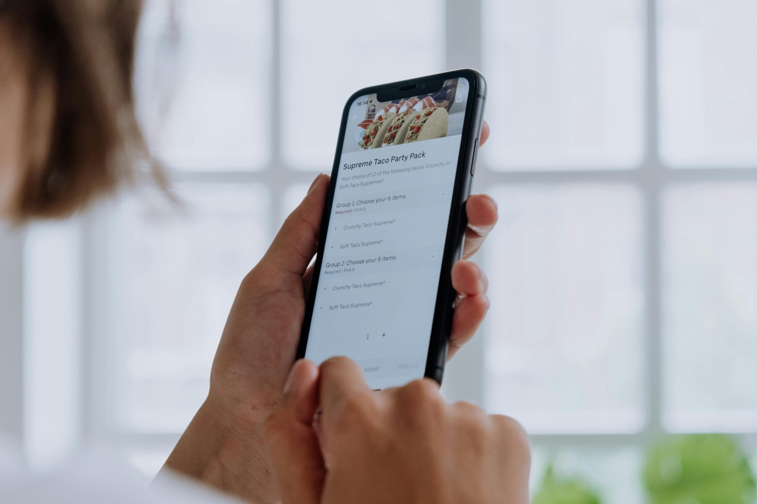
Forms represent the ultimate conversion bottleneck. Users have already invested attention and interest; now they face the tedious work of data entry. Every form field is a potential abandonment point, making microcopy absolutely crucial.
Field labels benefit from specificity. Instead of “Phone,” try “Mobile number for delivery updates.” This not only clarifies the format but also explains why you need the information—addressing the unspoken “why should I tell you?” concern that increases hesitation.
Placeholder text inside fields should provide format examples, not repeat the label. “MM/DD/YYYY” is helpful; restating “Date of Birth” is redundant. Inline validation messages should appear immediately when users complete a field, confirming correct input or gently correcting errors before submission.
Error Messages: Turning Failures Into Forward Motion
Traditional error messages blame users: “Invalid password.” Better microcopy acknowledges the situation and provides actionable guidance: “Password must include at least 8 characters, one number, and one special character.”
The tone matters enormously. Errors frustrate users who are already annoyed that something didn’t work. Microcopy that feels accusatory compounds that frustration; language that feels supportive maintains goodwill and keeps users engaged in resolving the issue.
Specificity prevents repeated errors. “Something went wrong” offers zero helpful information. “Unable to connect to server—please check your internet connection and try again” identifies the problem and suggests a solution, dramatically reducing user frustration.
Calls-to-Action: The Make-or-Break Moment
Button copy directly impacts conversion rates because it represents the commitment point. Generic labels like “Submit,” “Click Here,” or “Continue” create friction by failing to communicate value or set expectations.
Action-oriented, specific button text performs better: “Start My Free Trial,” “Download the Guide,” “Show Me Pricing.” These phrases clarify exactly what happens next, reducing uncertainty and increasing click-through rates.
For high-commitment actions like purchases, microcopy can address final objections. “Buy Now—Free Returns Within 30 Days” or “Subscribe Risk-Free (Cancel Anytime)” incorporate friction-reducing reassurances directly into the call-to-action.
🚀 Engagement Amplification Through Microcopy
While reducing friction focuses on removing obstacles, strategic microcopy can also actively increase engagement by creating moments of delight, building trust, and reinforcing brand personality.
Empty States: Transforming Nothing Into Something
When users first access an app or feature with no data yet, most products simply display blank screens. This represents a massive missed opportunity. Empty states with thoughtful microcopy can guide first actions, explain functionality, and set positive expectations.
Instead of “No messages,” try “Your inbox is empty—for now! Messages from your team will appear here.” This acknowledges the empty state while explaining what will eventually appear, reducing confusion and setting appropriate expectations.
Loading States: Making Wait Time Feel Shorter
When processes take time, users get anxious. Microcopy can’t speed up servers, but it can manage perceptions. Progress indicators with specific messages—”Analyzing your data,” “Generating your report,” “Almost there”—make wait times feel shorter by providing reassurance that work is happening.
Some companies use loading screens as opportunities for microcopy that entertains or educates: “Did you know…” facts, helpful tips, or lighthearted messages that turn dead time into engagement opportunities.
Success Confirmations: Reinforcing Positive Actions
After users complete actions, confirmation microcopy validates their efforts and reinforces the value received. Generic “Success!” messages work, but specific confirmations work better: “Profile updated! Your changes are now visible to your team.”
These moments are also opportunities to guide next steps. “Purchase confirmed! Check your email for tracking information” not only confirms completion but also sets expectations for what happens next, preventing unnecessary support inquiries.
Testing and Optimizing Your Microcopy Strategy
Like all UX elements, microcopy should be tested and refined based on actual user behavior. Assumptions about what reduces friction often prove wrong in practice, making data-driven optimization essential.
A/B Testing Microcopy Variations
Even small word changes can produce significant conversion differences. Testing “Get Started” against “Start Free Trial” on the same button might reveal unexpected preferences. The key is testing one element at a time to isolate what drives performance changes.
Common testing opportunities include button labels, form field instructions, error message phrasing, and onboarding copy. Track not just click-through rates but completion rates—sometimes more clicks don’t translate to more conversions if subsequent friction points cause abandonment.
User Feedback and Heat Mapping
Quantitative testing reveals what performs better, but qualitative research explains why. User testing sessions where participants think aloud while navigating your product expose microcopy friction points you might never otherwise identify.
Heat mapping and session recording tools show where users hesitate, re-read text, or hover uncertainly before clicking. These behavioral patterns indicate microcopy that’s unclear or unconvincing, highlighting specific improvement opportunities.
💡 Industry-Specific Microcopy Considerations
While principles remain consistent, optimal microcopy varies significantly across industries due to different user expectations, risk tolerances, and regulatory requirements.
E-commerce: Overcoming Purchase Anxiety
Online shopping involves significant trust barriers. Microcopy must address concerns about product quality, shipping times, return policies, and payment security. Strategic placement of reassurances—”Free returns within 60 days,” “Secure checkout guaranteed,” “In stock—ships today”—reduces pre-purchase friction.
Cart abandonment often stems from unexpected costs. Microcopy that sets shipping expectations early (“Free shipping on orders over $50”) prevents the shock that occurs when users reach checkout and discover additional fees.
SaaS Products: Reducing Complexity Overwhelm
Software platforms face the challenge of powerful features creating interface complexity. Microcopy serves as an embedded help system, explaining options without requiring users to visit documentation.
Tooltips, inline explanations, and contextual help text make advanced functionality accessible to new users while remaining unobtrusive for experienced ones. Feature descriptions should focus on benefits rather than technical specifications: not “Enable API webhooks,” but “Get instant notifications when events occur.”
Financial Services: Building Trust Through Transparency
Banking, investing, and insurance applications deal with users’ money, making trust paramount. Microcopy must balance reassurance with regulatory compliance, explaining complex terms without oversimplifying to the point of inaccuracy.
Every data request should include clear explanations of why information is needed and how it will be protected. Investment disclaimers, while legally necessary, can be written in approachable language that users actually read rather than immediately dismissing.
Common Microcopy Mistakes That Increase Friction
Understanding what not to do is equally important as knowing best practices. These frequent errors create unnecessary friction despite good intentions.
Using jargon or internal terminology that users don’t understand creates immediate confusion. What your team calls a “workspace” might be unclear to users who would better understand “project folder.” Always use customer language, not company language.
Overly apologetic or negative framing can undermine confidence. “Sorry, we couldn’t process your request” sounds worse than “Unable to process request—please try again.” Acknowledge issues without excessive self-flagellation that makes your product seem unreliable.
Unnecessarily wordy microcopy defeats its purpose. These snippets should be scannable at a glance. If your button label requires reading comprehension effort, it’s too long. Ruthlessly edit to the essential message.
Inconsistent terminology across the interface forces users to wonder if different words mean different things. If you call something a “profile” in one place, don’t call it an “account” elsewhere. Maintain a consistent vocabulary throughout the experience.
Building a Microcopy Style Guide
As products scale and teams grow, maintaining consistent, high-quality microcopy requires documentation. A microcopy style guide ensures everyone creating interface text follows the same principles.
Your guide should define voice and tone guidelines specific to different situations. How should error messages sound? What personality emerges in empty states? When should copy be formal versus conversational? Documenting these decisions prevents inconsistency.
Include standard phrasings for common elements: form validation messages, success confirmations, permission requests, and loading states. This library of approved copy reduces decision fatigue while maintaining consistency.
Provide before-and-after examples showing how to improve weak microcopy. These concrete illustrations teach principles more effectively than abstract rules, helping team members develop better microcopy instincts over time.
🎨 The Future of Microcopy: Personalization and AI
Emerging technologies enable microcopy that adapts to individual users, creating hyper-relevant experiences that further reduce friction and increase engagement.
Personalized microcopy can address users by name, reference their previous actions, or adjust based on behavior patterns. “Welcome back, Sarah! Ready to continue your workout?” feels more engaging than generic “Welcome back” messages.
Machine learning can identify when specific users struggle with particular interface elements, automatically surfacing additional help text or simplified explanations for those who need it while keeping interfaces clean for experienced users.
Dynamic microcopy that responds to context—time of day, location, device type, or external factors—creates experiences that feel remarkably intuitive. Offering “One-click reorder your usual” to a regular customer or “Running low? Subscribe and save 15%” when purchase patterns suggest routine buying demonstrates how smart microcopy anticipates needs.
Measuring the Impact of Improved Microcopy
Demonstrating ROI justifies continued investment in microcopy optimization. Several metrics effectively capture the business value of friction reduction.
Conversion rate improvements directly tied to microcopy changes prove financial impact. If changing a button label increases conversions by 12%, calculate the revenue difference over time—the numbers often surprise stakeholders who considered text “just cosmetic.”
Task completion rates measure how successfully users accomplish specific goals. If form completion rates rise after clarifying field instructions, or account creation increases after simplifying onboarding copy, microcopy deserves credit.
Support ticket volume reduction indicates that better microcopy is answering questions proactively. If clarifying error messages decreases “what does this mean?” support contacts, you’ve saved customer service resources while improving user experience.
Time-on-task metrics show efficiency gains. When users complete processes faster after microcopy improvements, you’ve reduced friction—less hesitation, less confusion, more confidence in moving forward.

🌟 Transforming User Experience One Word at a Time
The cumulative effect of thousands of tiny text improvements creates products that feel fundamentally easier to use. Users may not consciously notice specific microcopy, but they absolutely feel its presence or absence in the overall experience quality.
Companies that invest in strategic microcopy gain competitive advantages through higher conversion rates, increased user satisfaction, and reduced support costs. These benefits compound over time as refined copy continues performing long after the initial optimization effort.
The true power of microcopy lies not in any single phrase but in the systematic application of user-centered communication principles throughout the entire product experience. Every button, every field, every message represents an opportunity to guide, reassure, or delight—or to confuse, frustrate, and lose users.
Success in the digital economy increasingly depends on eliminating friction and maximizing engagement. While many factors contribute to these outcomes, microcopy stands out for its combination of high impact and relative ease of implementation. You don’t need to rebuild architecture or redesign interfaces—just write better words.
Start by auditing your current microcopy. Identify the top five friction points in your user journey. Test improved copy at those critical moments. Measure results. Iterate based on data. This methodical approach transforms microcopy from an afterthought into a strategic advantage that drives measurable business results.
The conversation between your product and its users happens largely through microcopy. Make every word count, and watch those small changes create outsized impact on your bottom line and user satisfaction scores alike.